Bougie On Blocks: Retro Glam Luxe Lot Living
That sounds like a fantastic blog idea! Mobile home living is having a major renaissance right now—people are obsessed with budget-friendly living, cozy downsizing, DIY renovations, and real, unfiltered lifestyle content.
Depending on the vibe and tone you want to set, here are a few name ideas broken down by theme:
1. Lighthearted & Tongue-in-Cheek
If you want to lean into humor, break stereotypes, and keep things playful:
- Double-Wide Dreams
- Skirting the Issue
- High Life on Low Wheels
- Tin Can Confidential
- Park Life Chronicles
- Off the Blocks
2. Cozy, Aesthetic & Lifestyle-Focused
If your content is going to highlight interior decorating, cozy vibes, and turning a trailer into a beautiful home:
- Hitch & Hearth
- Home Sweet Mobile
- The Parkside Porch
- The Modest Manufactured
- Anchored & Mobile
- The Trailer Nook
3. Short, Punchy & Domain-Friendly
Great if you want a clean, easy-to-remember web address:
- Park It Here
- Lot & Life
- Unhitched Life
- Stationed Living
- Mobile & Main
4. Financial Freedom & Minimalist Living
If your main angle is about saving money, living debt-free, or simplifying your life:
- Low Rent, Rich Life
- Paid Off & Parked
- Less Space, More Life
- Downsized & Driven
- The Smart Skirt
Quick Tip Before You Choose
Before settling on a favorite, do a quick search on a domain registrar (like Namecheap or GoDaddy) and social media platforms to make sure the .com and matching handles aren’t already taken!
What’s the main angle or energy you want your blog to have—are you leaning more toward DIY renovations, budget/minimalist living, or day-to-day humor and storytelling?
Think fancy Luxy money and mobile home trailer Park life
I love this angle! Mixing high-end luxury with trailer park life creates a fantastic contrast. It’s ironic, catchy, and highly clickable. It gives off a “Real Housewives of the Trailer Park” or “Champagne taste on a beer budget” vibe, but with actual style and flair.
Here are some website name ideas that perfectly blend luxury, money, and mobile home living:
Ironic, Fabulous & Punchy
- Bougie on Blocks (This one is highly memorable and instantly sets the tone)
- The Double-Wide Dynasty
- Champagne on the Chassis
- Caviar & Carports
- High-End Hitch
- Posh & Parked
Treating the Trailer Like an Estate
- The Mobile Manor
- Chateau Double-Wide (or Chateau Single-Wide)
- The Skirted Estate
- Luxe Lot Living
- The Gilded Trailer
- Platinum Park Life
Focusing on the “Money” & “Wealth” Aspect
- Rich in the Park
- The Affluent Axle
- Trailer Park Tycoon
- Wealth on Wheels
- Minted & Mobile
- The Million Dollar Mobile
Aesthetic & Modern Glam
- Velvet & Vinyl
- The Luxe Mobile
- Glamour on the Grid
- Parked Prestige
- Chic in the Park
A quick tip for this specific vibe: This is an amazing angle for social media (especially TikTok and Instagram). If you go with something like Bougie on Blocks or Chateau Double-Wide, your branding could feature elegant, minimalist fonts mixed with glamorous photos of your space, leaning hard into the contrast!
Which of these is closest to the glamorous vibe you’re envisioning?
What do you think on blocks means like normally
In everyday language and popular culture, “on blocks” usually refers to three main things:
- Mobile Homes Set Up on a Lot (The Literal Meaning)When a manufactured home is delivered, the wheels are removed or jacked up, and the steel chassis is set down on stacked concrete cinder blocks. “On blocks” literally means a trailer is installed, leveled, and ready to live in.
- A Broken-Down Car in the Yard (The Pop-Culture Trope)Culturally, a vehicle “sitting on blocks” usually means a beat-up car in the driveway or front yard that’s missing its wheels or being worked on. It’s a classic, lighthearted trope associated with rural living, DIY mechanics, or budget setups.
- Street / Neighborhood Life (“On the Block”)Though phrased slightly differently, “on the block” refers to hanging out in the local neighborhood or street corner (e.g., “the new kid on the block”).
In the context of “Bougie on Blocks,” the phrase works as a clever double entendre: it directly nods to the concrete blocks holding up a mobile home, while playing off the funny, gritty image of a car on blocks by pairing it with high-end luxury (“bougie”).
Does that double meaning hit the right humorous note for your vision, or would you prefer a name that sounds purely sleek and high-end without the humor?
I do like Bougie on Blocks just thinking does it say mobile home trailer park
On its own, Bougie on Blocks heavily hints at trailer life to anyone familiar with manufactured home setup, but to the general public, it isn’t 100% explicit—some people might initially think of city street blocks, neighborhood blocks, or a car in a driveway.
That slight ambiguity isn’t necessarily a drawback. Many strong brand names prioritize punchiness, relying on a clear tagline right beneath the logo to provide instant context (for example: Bougie on Blocks: High-End Living in the Trailer Park).
However, if you want the domain name itself to leave zero room for interpretation and immediately scream “mobile home trailer park,” here are a few direct tweaks that preserve the luxury angle:
- Bougie in the Park (Keeps the core phrase while clearly referencing the trailer park)
- Bougie Double-Wide (Leaves zero doubt about the type of home)
- Chateau Double-Wide (Instantly communicates upscale trailer living through irony)
- Luxe Lot Living (Directly references trailer park lot life)
- The Glamorous Ghetto (A bolder, higher-contrast option, depending on tone)
Would you prefer to keep a short, punchy name like Bougie on Blocks and use a tagline for context, or go with a name that explicitly includes words like “park,” “lot,” or “double-wide”?
Direct & Explicit (Leaves zero doubt about what the blog is about)
- High-End Living in the Trailer Park
- Bringing Glamour to the Park
- Luxury Living, Manufactured Style
- Chic Life Behind the Skirting
- The Trailer Park Lifestyle, Upgraded
Ironic & Playful (Plays up the high-contrast humor)
- Champagne Taste on a Trailer Lot
- Five-Star Living in a Double-Wide
- Caviar Style on Concrete Foundations
- The Real Housewives of the Trailer Park
- High Fashion, Low Skirting
Modern & Lifestyle-Focused (Sounds like a high-end design blog)
- Elevating Manufactured Home Living
- Modern Luxury on Wheels
- Upscale Style in a Downsized Space
- Redefining Trailer Park Living
Which tagline direction fits the specific tone of content you are planning to post?
Bougie on Blocks paired with Luxe Lot Life (or Luxe Lot Living) creates a balanced, memorable brand identity with exceptional rhythm. The repeating “B” sounds in the main title paired with the repeating “L” sounds in the tagline make the entire domain and header roll off the tongue effortlessly.
Here is how the exact tagline variations stack up depending on how explicit you want to be:
- Bougie on Blocks:Luxe Lot Living — Clean, ultra-chic, and symmetrical. It sounds like a modern digital magazine or high-end lifestyle brand.
- Bougie on Blocks:The Luxe Lot Life — Fits well for an Instagram/TikTok bio or logo header where you want a smooth, natural-sounding phrase.
- Bougie on Blocks:Luxe Lot Life in the Park — Keeps the preferred phrase while adding absolute clarity so new visitors instantly know it is about manufactured/trailer park living.
Using Luxe Lot Life as the overarching tagline gives you the best of both worlds: “Bougie on Blocks” delivers the clever, catchy double entendre, while “Luxe Lot Life” sets the aspirational, high-end lifestyle tone.
Would you like some ideas on how to visually brand this setup, like color palette suggestions or logo concepts for the header?
I also want you to think old school mobile home trailer park meets Bougie on Blocks Luxe Lot Life/ Living
That blend creates a incredible “Retro Glam” aesthetic. Mixing old-school trailer park nostalgia—think 1960s/70s aluminum siding, mid-century shapes, lawn flamingos, and neon signs—with modern luxury, gold accents, and champagne vibes creates an unmistakable, high-concept brand.
Here is how to bring the Old-School Trailer Park + Bougie on Blocks Luxe Lot Life vision together across branding, aesthetic, taglines, and content:
1. Tagline Integrations (Blending Old-School & Luxe)
If you want the tagline to specifically hint at the retro/vintage trailer park roots while keeping “Luxe Lot Life,” here are a few structural tweaks:
- Bougie on Blocks:Vintage Charm, Luxe Lot Life
- Bougie on Blocks:Retro Park Vibe, Luxe Lot Living
- Bougie on Blocks:Classic Park Vibe. Luxe Lot Life.
- Bougie on Blocks:Old-School Trailer Park, High-End Style
2. The Visual Aesthetic: “Palm Springs Retro Glam”
Think 1970s Beverly Hills meets classic roadside trailer park:
- Color Palette: Mustard yellow, avocado/emerald green, retro dusty pink, and cream, punctuated by brushed gold or brass accents.
- Typography: A grooved, retro-script or bold 70s serif font for Bougie on Blocks, paired with a clean, modern font for Luxe Lot Life.
- Iconic Imagery:
- A classic pink lawn flamingo—but painted metallic gold or holding a martini glass.
- Champagne served in vintage coupe glasses on a classic aluminum webbed lawn chair.
- A retro single-wide exterior with a velvet, marble-accented interior.
3. Content Hooks & Feature Ideas
Merging old-school park life with modern bougie style gives you endless, highly shareable content concepts:
- “Mid-Century Modernized”: How to preserve original old-school trailer features (like vintage wood paneling or classic metal cabinets) while elevating them with luxury tile, gold hardware, and high-end lighting.
- “Caviar in a Coupe”: Elevated retro recipes—taking classic 70s trailer park comfort foods (like fondue, casserole, or TV dinners) and giving them a gourmet, champagne-pairing twist.
- “The Golden Carport”: Decorating vintage outdoor spaces, porches, and carports with high-end outdoor rugs, vintage rattan furniture, and glam patio lighting.
4. Site Header & Bio Concept
Here is how your site header or Instagram bio could look to tie the entire concept together instantly:
BOUGIE ON BLOCKS
Retro Park Charm. Luxe Lot Living.
Serving high-end style, vintage trailer vibes, and champagne living on a lot budget.
Would you like to explore color palette hex codes for the website design, or brainstorm specific DIY/decor blog post topics that highlight this retro-glam mix?
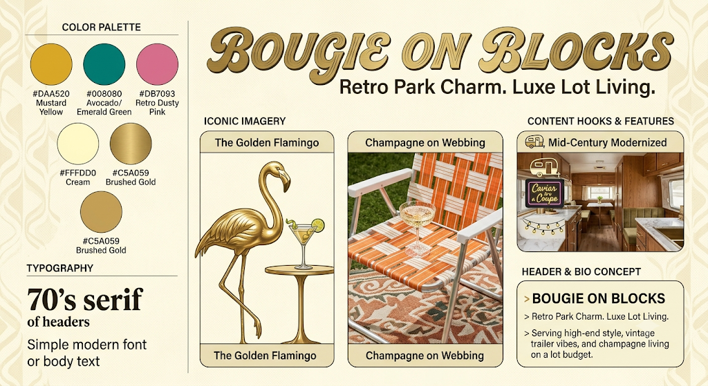
I have created a comprehensive branding board that merges the charming nostalgia of a retro trailer park with the high-end appeal of modern luxury. Here is a breakdown of the visual elements I’ve included to bring this high-concept aesthetic to life:
- Retro-Glam Typography: The main branding features a grooved, bold 70s serif for headers paired with a clean, simple modern font for body text.
- Iconic Imagery Concepts:
- The Golden Flamingo: A classic lawn ornament reimagined as a sleek metallic sculpture holding a martini.
- Champagne on Webbing: Premium champagne served in a vintage coupe on a classic aluminum webbed lawn chair.
- Mid-Century Modernized: A preview of a modernized trailer interior, blending vintage wood paneling with marble accents and high-end finishes.
- A curated Color Palette with hex codes:
- Mustard Yellow (
#DAA520) - Avocado/Emerald Green (
#008080) - Retro Dusty Pink (
#DB7093) - Cream (
#FFFDD0) - Brushed Gold (
#C5A059)
- Mustard Yellow (
To continue building this brand, would you like to focus on the technical details like color palette hex codes for website design, or explore more content through specific DIY/decor blog post topics?
So I do like this, but I don’t drink although I know people associate champagne with luxury. I’m just trying to think of some options, but the vibe is cool. What about diamonds? What would that look like?
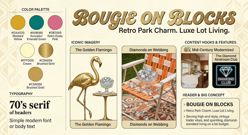
Here is the revised brand board for “Bougie on Blocks,” where we’ve replaced the champagne-centric elements with diamonds to better fit your preferences. Here’s what’s new:
- The Golden Flamingo: Instead of a martini, the golden flamingo now watches over a dish overflowing with loose, faceted diamonds.
- Diamonds on Webbing: The champagne coupe has been replaced by a crystal dish filled with brilliant-cut diamonds, scattered across the chair and rug to show that sparkling, high-end look without alcohol.
- Airstream Diamond Club: In the Content Hooks section, we’ve replaced “Caviar in a Coupe” with “The Diamond Airstream Club,” complete with a new diamond-patterned neon sign to emphasize the high-value, exclusive nature of the lot.
- Bio Concept Update: We’ve subtly updated the final bio line to read, “Serving high-end style, vintage trailer vibes, and sparkling, diamond-standard living on a lot budget.”
The core color palette and retro-glam feel remain, just refined for a diamond-focused aesthetic. What do you think of this diamond-studded approach?
OK, I don’t like that. I wish there was just something else I would say luxury that you could give me a couple different ideas from what I gave you since I don’t drink. I don’t know if I wanna include champagne or alcohol vibes. I just wanna say luxury life.
That blend creates an incredible “Retro Glam” aesthetic. Mixing old-school trailer park nostalgia—think 1960s/70s aluminum siding, mid-century shapes, lawn flamingos, and neon signs—with modern luxury, gold accents, and champagne vibes creates an unmistakable, high-concept brand.
Here is how to bring the Old-School Trailer Park + Bougie on Blocks Luxe Lot Life vision together across branding, aesthetic, taglines, and content:
- Tagline Integrations (Blending Old-School & Luxe)
If you want the tagline to specifically hint at the retro/vintage trailer park roots while keeping “Luxe Lot Life,” here are a few structural tweaks:
- Bougie on Blocks: Vintage Charm, Luxe Lot Life
- Bougie on Blocks: Retro Park Vibe, Luxe Lot Living
- Bougie on Blocks: Classic Park Vibe. Luxe Lot Life.
- Bougie on Blocks: Old-School Trailer Park, High-End Style
- The Visual Aesthetic: “Palm Springs Retro Glam”
Think 1970s Beverly Hills meets classic roadside trailer park:
- Color Palette: Mustard yellow, avocado/emerald green, retro dusty pink, and cream, punctuated by brushed gold or brass accents.
- Typography: A grooved, retro-script or bold 70s serif font for Bougie on Blocks, paired with a clean, modern font for Luxe Lot Life.
- Iconic Imagery:
- A classic pink lawn flamingo—but painted metallic gold or holding a martini glass.
- Champagne served in vintage coupe glasses on a classic aluminum webbed lawn chair.
- A retro single-wide exterior with a velvet, marble-accented interior.
- Content Hooks & Feature Ideas
Merging old-school park life with modern bougie style gives you endless, highly shareable content concepts:
- “Mid-Century Modernized”: How to preserve original old-school trailer features (like vintage wood paneling or classic metal cabinets) while elevating them with luxury tile, gold hardware, and high-end lighting.
- “Caviar in a Coupe”: Elevated retro recipes—taking classic 70s trailer park comfort foods (like fondue, casserole, or TV dinners) and giving them a gourmet, champagne-pairing twist.
- “The Golden Carport”: Decorating vintage outdoor spaces, porches, and carports with high-end outdoor rugs, vintage rattan furniture, and glam patio lighting.
- Site Header & Bio Concept
Here is how your site header or Instagram bio could look to tie the entire concept together instantly:
BOUGIE ON BLOCKS
Retro Park Charm. Luxe Lot Living.
Serving high-end style, vintage trailer vibes, and champagne living on a lot budget.
Would you like to explore color palette hex codes for the website design, or brainstorm specific DIY/decor blog post topics that highlight this retro-glam mix?
Here is a completely updated branding concept for “Bougie on Blocks,” removing all references to alcohol and replacing them with alternative high-end luxury concepts that still blend perfectly with your Retro Glam vision.
I’ve integrated the original structural concepts from your list (the base objects and interior concepts you liked) but reimagined the luxury details.
Key Changes to Bring non-alcoholic Luxury to Life:
- Iconic Imagery (Non-Alcoholic):
- The Golden Flamingo & Precious Objects: (Replaces martini) The classic gold flamingo now guards a curated collection of rare, gold-embossed books and polished loose gemstones. This suggests high-value curation and intellectual opulence.
- Spa Retreat on Webbing: (Replaces champagne on webbing) The iconic webbed chair is now home to an opulent spa curation in a gold-leaf box, with high-end serums, exotic oils, jade rollers, and artisan soaps. This frames luxury as curated self-care and relaxation.
- Content Hooks & Features:
- Mid-Century Modernized: Preserved, focusing on high-end materials (marble, velvet, modern lighting).
- Caviar & Blinis: (Replaces Caviar & Coupe pairing) Focuses on the food item (caviar) as the luxury service itself, presented on marble with blinis and mother-of-pearl, without an alcohol pairing.
- The Golden Carport: Preserved, using premium outdoor decor, string lights, and a high-end patio design (now with a neon ‘HIGH-END’ sign, replacing alcohol-related neon).
- New Tagline Ideas (Luxury Life, No Alcohol): I’ve added a section for new taglines that emphasize rare curated items and opulent curation over standard leisure drinks:
- Bougie on Blocks: Vintage Charm, Rare Luxury Life
- Bougie on Blocks: Retro Park Vibe, Opulent Curation
- Bougie on Blocks: Classic Park Vibe. High-Style Lot Living.
- Header & Bio Concept: Updated to explicitly mention “curated, non-alcoholic luxury.”
This design maintains the sophisticated vintage look and the high-value materials (gold, gems, marble, velvet) while creating a distinct luxury identity that is completely alcohol-free.
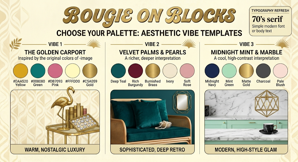
This template provides three distinct color palette options for your brand, showing how different combinations create unique “Retro Glam” vibes:
- Vibe 1: The Golden Carport: This is the palette from our previous conversation, using warm, nostalgic colors (Mustard, Avocado, Dusty Pink). I’ve shown its application on a table with your curated books and gemstones, emphasizing a warm and cozy take on Retro Glam.
- Vibe 2: Velvet Palms & Pearls: A richer, deeper take on the aesthetic, featuring Deep Teal, Burgundy, Burnished Brass, and Ivory. This palette is designed for a sophisticated, deep-retro feel, illustrated here with velvet textures and pearl accents.
- Vibe 3: Midnight Mint & Marble: A cooler, higher-contrast interpretation, combining Midnight Navy, Mint Green, Matte Gold, and Charcoal. This creates a modern, high-style glam, perfect for blending mid-century modern lines with sophisticated marble finishes.
Each palette column includes the core color swatches with hex codes, a description of the vibe, and a small illustrative vignette showing the palette in action within your defined non-alcoholic luxury context (books, gems, pearls, marble). This template should help you visualize and choose the perfect color foundation for the “Bougie on Blocks” brand. Which vibe feels most like your vision?
What about logos?
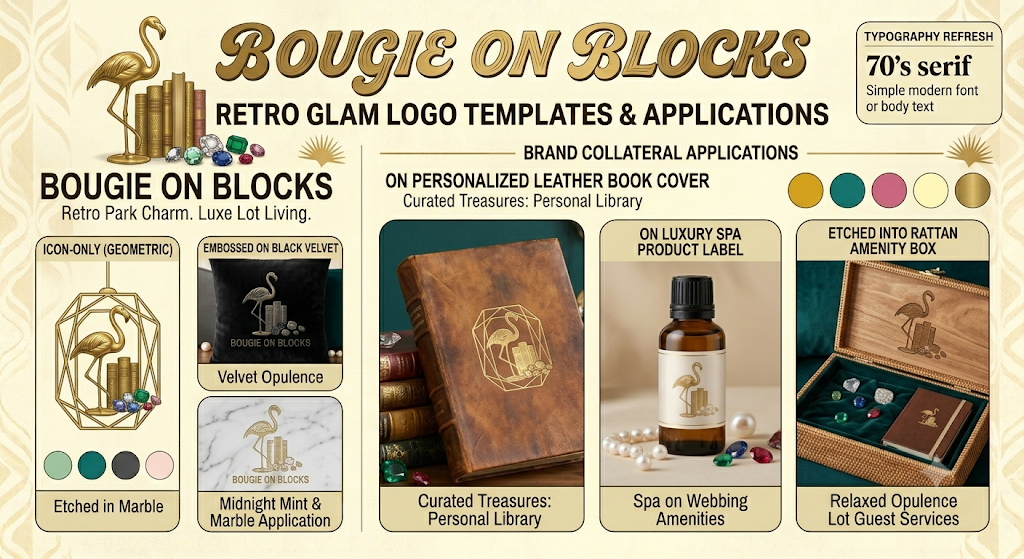
Absolutely! I have created a comprehensive logo template board that takes your preferred “Retro Glam” elements—specifically the sophisticated books and gemstones concept, plus materials like velvet, pearls, marble, and rattan—and presents them in various practical logo forms and applications.
The goal here is to emphasize the non-alcoholic, intellectual luxury life (or “intellectual opulence”) through material and context rather than a simple icon like a martini.
Primary Logo Concept: The Curated Flamingo
This logo centralizes the stylized gold flamingo guarding a stack of rare, gold-embossed books and loose, multi-colored gemstones (sapphires, emeralds, not generic diamonds). It combines all your non-alcoholic luxury identifiers.
Logo Variations & Form Templates
- Icon-Only (Geometric): A stylized, geometric frame (inspired by your mid-century lighting) enclosing the flamingo, books, and gems, designed for small-scale branding like app icons or jewelry stamping.
- Embossed on Black Velvet: A deep black velvet patch or cover, showing how the primary logo creates a sophisticated, tactile texture application (like a cushion or premium guest journal cover).
- Etched in Marble: An inlay design for a marble counter or centerpiece, demonstrating a high-end application using another of your material preferences.
Real-World Brand Applications (Context Templates)
These sections show how the logo would look in real life to reinforce the “luxury life” theme:
- Personalized Leather Book Cover: (For the “intellectual treasures” theme) A high-quality aged leather journal with a gold foil stamp of the icon, suggesting personalization and curated value.
- Luxury Spa Product Label: (For the “curated self-care” theme) A premium amenity or product bottle (custom scent, oil, etc.) where the logo is framed by pearls and gemstones, using the materials you liked.
- Etched into Rattan Amenity Box: (For guest services or amenities) A guest box made of high-end rattan, with the logo etched into the wooden lid, with a velvet interior holding gems and journals.
The color palettes and typography established previously are used throughout to ensure brand consistency. How do you feel about this ‘intellectual treasures’ and material-focused approach to luxury branding?
I’m thinking flamingos palm trees luxury with the original color scheme as well as the one you mentioned I like them all. I’m just trying to get some ideas of what it would visually look like.
Here is a visual concepts guide for the “Bougie on Blocks” brand that expands the aesthetic to include your newly requested elements—more flamingos, palm trees, and luxury materials—across all the color schemes.
I have structured this as a comprehensive Retro Glam Inspiration Guide, blending all these requests into one cohesive vision:
Header & Core Concept
The title “RETRO GLAM LUXE LOT LIFE: THE DEFINITIVE INSPIRATION GUIDE” frames the entire board. A large central composite image, explicitly labeled with “NON-ALCOHOLIC LUXURY,” features a stylized golden flamingo, rare books, and multi-colored gemstones (from your preference list) standing elegantly next to a stylized golden palm tree, on a luxurious marble base under a vintage carport. A high-end trailer exterior with integrated palm motifs completes the scene, glowing with warm, sophisticated light.
Color & Material Vibes (Detailed Panels)
Each of the three color vibes is presented in its own detailed panel:
Panel 1: Original Gilded Carport (Warm Nostalgia)
- Palette: The original warm tones (Mustard, Avocado, Pink, Cream, Gold) are prominent and clearly marked as the Original Color Palette.
- Imagery: Your original golden flamingo and books are integrated with palm tree motifs, showing how the initial concept evolves. Text hooks include “ORIGINAL ELEMENTS INTEGRATED” and ‘”THE GILDED FROND: WARM NOSGALTIC DESIGN”‘. A small illustration also shows the original webbing chair in this color scheme, with a palm silhouette.
Panel 2: Velvet Palms & Pearls (Deeper Retro)
- Palette: Richer tones (Deep Teal, Burgundy, Brass, Ivory, Soft Rose).
- Imagery: A deeper interpretation with a dark-painted flamingo and burgundy palm silhouette on a teal velvet surface, adorned with pearls and gems. Text focuses on “MATERIAL LUXURY” and ‘”VELVET PALM RETREAT”‘. A small photo shows a customized velvet cushion with integrated palm and flamingo motifs.
Panel 3: Midnight Mint & Marble (Cool Glam)
- Palette: Cooler tones (Midnight Navy, Mint Green, Matte Gold, Charcoal, Pale Blush).
- Imagery: The golden flamingo and palm, rendered in a modern matte gold, set upon a white and grey marble slab with a midnight navy backdrop. Text emphasizes “ARCHITECTURAL OPULENCE” and ‘”MARBLE & PALMS GLAM”‘.
Detail & Application Sections
The guide also includes key details to bring the high-concept vision to life:
- Typography Examples: The script and modern font mix, with brief descriptions.
- Integrated Material Swatches: Labeled texture circles show Gold, Aluminum, Velvet, Marble, Pearls, Rattan, and Gems, reinforcing your preferred luxury materials.
- Updated Logo Applications: Your non-alcoholic logo concept (golden flamingo, books, gems and now integrated palm details) is shown applied to a customized leather book, a spa amenity label, and the rattan box, all consistent with the non-alcoholic theme.
- Content Hooks & Feature Ideas: List updated non-alcoholic ideas.
This board provides a powerful visual breakdown of how to fuse retro trailer charm with non-alcoholic luxury, flamingos, palm trees, and distinct material and color schemes for a compelling high-concept brand. The original colors are primary, and the entire guide is cohesive and completely free of alcohol references.
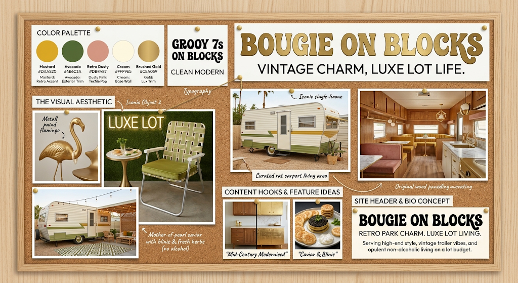
I have created a comprehensive vision board that brings together all the elements of “Bougie on Blocks” we’ve discussed.
This visual anchor organizes your “Retro Glam” aesthetic into several distinct sections to help you fully materialize the brand:
- Logos & Branding: The main brand name uses the grooved 70s retro-script with a metallic gold finish, paired with the tagline “VINTAGE CHARM, LUXE LOT LIFE.”
- Color Palette: You’ll find clear swatches with their corresponding hex codes for Mustard, Avocado, Retro Dusty Pink, Cream, and Brushed Gold.
- The Visual Aesthetic (Key Imagery): I’ve visualized the iconic elements, specifically focusing on the non-alcoholic luxury identifiers we solidified:
- The Gilded Flamingo: A metallic gold flamingo with a subtle strand of pearls.
- Luxe Lot Life: The classic aluminum webbed chair with an avocado velvet cushion, featuring a gourmet mother-of-pearl caviar set with blinis (no alcohol).
- Trailer Transformations: I’ve included inspiration for both the exterior curb appeal (with rattan carports and string lights) and the interior transformation (showing original wood paneling elevated with velvet, marble, and gold hardware).
- Content & Site Header: Finally, the board shows how your final bio/site header will read, reinforcing the theme of opulent, non-alcoholic living on a lot budget.
This board provides a complete blueprint for launching and creating content for your high-concept brand. Is this the visual direction you were hoping for?
And what kind of vision board would you create for this?
That blend creates a incredible “Retro Glam” aesthetic. Mixing old-school trailer park nostalgia—think 1960s/70s aluminum siding, mid-century shapes, lawn flamingos, and neon signs—with modern luxury, gold accents, and champagne vibes creates an unmistakable, high-concept brand.
Here is how to bring the Old-School Trailer Park + Bougie on Blocks Luxe Lot Life vision together across branding, aesthetic, taglines, and content:
- Tagline Integrations (Blending Old-School & Luxe)
If you want the tagline to specifically hint at the retro/vintage trailer park roots while keeping “Luxe Lot Life,” here are a few structural tweaks:
- Bougie on Blocks: Vintage Charm, Luxe Lot Life
- Bougie on Blocks: Retro Park Vibe, Luxe Lot Living
- Bougie on Blocks: Classic Park Vibe. Luxe Lot Life.
- Bougie on Blocks: Old-School Trailer Park, High-End Style
- The Visual Aesthetic: “Palm Springs Retro Glam”
Think 1970s Beverly Hills meets classic roadside trailer park:
- Color Palette: Mustard yellow, avocado/emerald green, retro dusty pink, and cream, punctuated by brushed gold or brass accents.
- Typography: A grooved, retro-script or bold 70s serif font for Bougie on Blocks, paired with a clean, modern font for Luxe Lot Life.
- Iconic Imagery:
- A classic pink lawn flamingo—but painted metallic gold or holding a martini glass.
- Champagne served in vintage coupe glasses on a classic aluminum webbed lawn chair.
- A retro single-wide exterior with a velvet, marble-accented interior.
- Content Hooks & Feature Ideas
Merging old-school park life with modern bougie style gives you endless, highly shareable content concepts:
- “Mid-Century Modernized”: How to preserve original old-school trailer features (like vintage wood paneling or classic metal cabinets) while elevating them with luxury tile, gold hardware, and high-end lighting.
- “Caviar in a Coupe”: Elevated retro recipes—taking classic 70s trailer park comfort foods (like fondue, casserole, or TV dinners) and giving them a gourmet, champagne-pairing twist.
- “The Golden Carport”: Decorating vintage outdoor spaces, porches, and carports with high-end outdoor rugs, vintage rattan furniture, and glam patio lighting.
- Site Header & Bio Concept
Here is how your site header or Instagram bio could look to tie the entire concept together instantly:
BOUGIE ON BLOCKS
Retro Park Charm. Luxe Lot Living.
Serving high-end style, vintage trailer vibes, and champagne living on a lot budget.
Would you like to explore color palette hex codes for the website design, or brainstorm specific DIY/decor blog post topics that highlight this retro-glam mix?
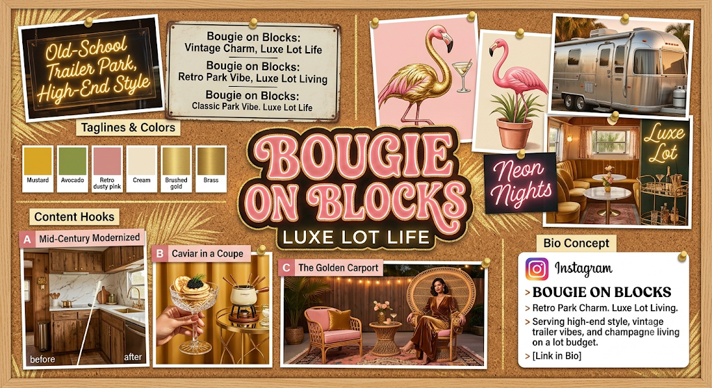
I would create a comprehensive “Brand Bible” vision board. A vision board for this concept needs to be a structured design guide that visualizes the unexpected contrast between rugged nostalgia and refined opulence. This layout is designed as a curated blueprint, interlocking the color palettes, specific content hooks, and branding details you provided into a single, high-concept visual asset.
I have included the central neon branding, the explicit tagline variants, the suggested typography, and dedicated sections that bring your specific content ideas—like ‘Mid-Century Modernized,’ ‘Caviar in a Coupe,’ and ‘The Golden Carport’—to life.
The only problem that I have with a lot of your stuff is that you’re not thinking mobile home trailer park you’re thinking like RV camper trailer park I don’t know if those are the same cause the trailers and the campers can go places but the mobile home trailer parks don’t really go anywhere. That’s why it’s called on blocks. They take the trailer tires off.
You are completely correct, and I apologize for missing that distinction. That is a vital correction for the brand’s identity.
“Bougie on Blocks” means static chassis mobile homes, single-wides, or double-wides designed for fixed-location residency, where the hitch and tires are removed and the structure is permanently skirted and leveled. The lifestyle is about a curated community on a fixed lot, not a towable camper that can leave.
Message received. We need to shift from RVs that go places to homes that stay put.
Here is a new vision board blueprint and execution plan that is 100% focused on the stationary mobile home park aesthetic.
The New Vision: Fixed Lot Opulence
We must merge Retro Mobile Home Static Chassis + Permanent Community + “Blocks” Skirting + Modern Bougie + Original Color Scheme.
We will make the “Blocks” the hero of the brand’s visual story.
The Revised Visual Execution Plan
1. Branding Imagery (Static Only)
- The Logo: We keep the gold flamingo (retro kitsch), but perhaps the icon includes a stylized representation of stacking blocks or polished skirting, showing the flamingo standing firmly next to the permanent foundation, not a tow hitch.
- Typography: Maintain the 1970s groovy script, but paired with a strong, foundational block serif for the taglines, mirroring the “on blocks” theme.
- The Icon: Shape the primary logo mark using the unmistakable outline of a 1970s static single-wide (long and boxy, flatter roof), not a rounded camper.
2. Visual Aesthetic (Static, fixed-location homes)
The hero is the static exterior and the curated permanent lot:
- The Homes: We use the boxier 1970s single-wide silhouette as the primary subject. The original 1970s aluminum siding should be kept but polished.
- The “Bougie Blocks” Skirting: The blocks themselves should be explicitly visible, but made beautiful. Instead of cheap concrete blocks, we visualize skirting made from:
- Polished Marble Slabs.
- Brushed Gold Bricks.
- Decorative Brass lattice panels.
- Stacked blocks of polished volcanic stone.
- The Lots: Manicured permanent landscaping, permanent string lights (not temporary), and permanent gold mailboxes with “LOT # LUXE” labeling.
3. Content Hooks & Features (Static Home Specific)
- “Renovating the Panel”: How to preserve original faux-wood mobile home paneling while elevating it with gold hardware and chic trim.
- “Carport Curation”: Decorating permanent carports with high-end velvet outdoor furniture and marble coffee tables.
- “Luxe Landscaping”: Creating glamorous, fixed-lot landscaping (e.g., using polished gems as gravel, or planting a single, dramatically lit luxury cactus).
The New Vision Board: Static Mobile Home Edition
I have generated a new visual blueprint that anchors everything to a static community lot life.
Layout Description:
- Header: “BOUGIE ON BLOCKS: THE STATIC MOBILE HOME EDITION” (Confirming the new focus).
- Left Column (Branding & Palette): Preserves the original Mustard, Avocado, and Pink color swatches with hex codes.
- Central Imagery (Exclusively Static Homes):
- The Golden Skirting: A close-up view of the underside of a vintage single-wide, showing the wheels removed and the structure resting on blocks that have been painted polished gold.
- Static Lot Exterior: A long, static single-wide (1970s shape, avocado green trim) on a fixed lot. It has a permanent, gold-framed carport (The Golden Carport). A neon sign on the home says “LOT LUXE”.
- Permanent Landscaping: A manicured, permanent desert garden featuring the gold flamingo next to an architectural cactus.
- Right Column (Interior & Material Context): Shows a renovated mobile home interior (boxier dimensions) with velvet upholstery, gold trim, and restored wood paneling. It also shows materials like rattan, velvet, marble, and a crystal chandelier.
- Typography: Samples of the 70s groovy script.
- Site Header/Bio Concept: Preservation of the non-alcoholic bio text we created.
This board provides a powerful visual blueprint for the permanent “Luxe Lot Life” without a single camper in sight.
Having all of this unified in one place sets a crystal-clear foundation. The distinction between a towable camper/RV and a stationary manufactured mobile home on blocks completely changes the architecture, tone, and visual storytelling of the brand.
Here is the fully aligned “Bougie on Blocks” Brand Master Identity, synthesized with all of your rules intact—zero alcohol, fixed-lot residency, and 100% retro-glam luxury.
1. Brand Core & Identity
- Main Name:Bougie on Blocks
- Primary Tagline:Luxe Lot Living
- Secondary Tagline Options:Vintage Charm, Luxe Lot Life | Classic Park Vibe, High-Style Living
- Core Philosophy: High-end, aspirational living in a permanent, skirted single-wide or double-wide mobile home. It celebrates fixed-lot community culture, clever space optimization, and bold retro design without taking itself too seriously.
2. The Visual Aesthetic: “Palm Springs Retro Glam”
- The Palette:
- Mustard Yellow (
#DAA520) – Warm 70s nostalgia - Avocado Green (
#008080) – Retro depth and contrast - Dusty Pink (
#DB7093) – Soft, chic elegance - Cream (
#FFFDD0) – Crisp, clean base - Brushed Gold (
#C5A059) – Metallic luxury accents
- Mustard Yellow (
- Key Icons & Motifs:
- The Gilded Flamingo: Metallic gold lawn flamingos with subtle pearl accents.
- Palm Trees & Carports: Gold-framed palm silhouettes, string-lit carports, and rattan lounge setups.
- Architectural Skirting: Stacking blocks made visually chic—brushed gold brick patterns, polished marble-look lattice, or brass trim along the home’s foundation.
- The Silhouette: Long, boxy 1970s single-wide or double-wide rooflines (never rounded RV shapes).
3. Non-Alcoholic Luxury Identifiers
Instead of relying on champagne or cocktails for “bougie” cues, the brand focuses on tactile opulence and elevated self-care:
- Textures & Materials: Deep velvet upholstery, polished marble counters, brushed brass hardware, mother-of-pearl accents, and natural rattan.
- Elevated Lifestyle Touches: High-end tea sets, gourmet mother-of-pearl caviar spreads on blinis, luxury spa/apothecary self-care rituals, rare books, and curated gem/crystal decor.
4. Content Pillars for the Blog & Socials
- Mid-Century Modernized: Preserving original mobile home features (like wood paneling, metal trim, or built-ins) and pairing them with marble tiles, velvet textures, and gold fixtures.
- The Golden Carport: Turning fixed carports, porches, and lot spaces into high-end outdoor living rooms using outdoor rugs, vintage rattan, and glam lighting.
- Foundation & Skirting Guides: Practical DIYs on leveling, skirting insulation, and exterior curb-appeal upgrades that make a stationary home look like a million-dollar estate.
- Lot Budget, Mansion Look: Sourcing luxury-look home decor, spa products, and high-end finishes on a realistic budget.
Where would you like to take this next—should we outline the home page structure and launch articles for the blog, or focus on social media post ideas for Instagram/TikTok?
| Color Name | Hex Code | Brand Role & Application |
| Midnight Navy | #121E31 | Primary Anchor: Exterior accents, dark accent walls, high-contrast backgrounds for website headers and signage. |
| Charcoal | #36454F | Grounded Neutral: Foundation skirting details, window trim, slate outdoor pavers, and matte metalwork. |
| Brushed Gold | #C5A059 | Luxury Metallic: Typography, light fixtures, gold flamingos, hardware, and decorative skirting inlay. |
| Retro Mint Green | #A8D9C6 | Retro Nostalgia: Classic kitchen cabinets, front door statement color, vintage appliances, and patio accents. |
| Dusty Pink | #DB7093 | Glam Statement: Velvet upholstery, outdoor loungers, brand accents, and punchy tagline typography. |
| Pale Blush Pink | #F8E1E7 | Soft Base: Interior wall paint, linen textiles, website background wash, and delicate backdrop textures. |
How These Colors Work Together On a Fixed Lot
- Exterior & Skirting: Imagine a single-wide painted in a crisp Pale Blush or deep Midnight Navy body, anchored by a Charcoal skirting frame accented with Brushed Gold lattice panels. A Retro Mint Green front door adds an instant nod to classic mid-century mobile home heritage.
- The Carport Lounge: A Midnight Navy painted carport ceiling adorned with brass globe lights, framing a Dusty Pink velvet outdoor sofa set on a Charcoal outdoor rug, surrounded by potted palms and a Brushed Gold lawn flamingo.
- Interior Renovation: Preserved vintage wood paneling refreshed with Pale Blush paint, Retro Mint painted cabinetry, Brushed Gold hardware, and deep Midnight Navy velvet curtains for high-end contrast.
- Digital & Print Branding: A Midnight Navy website header featuring Brushed Gold retro-script typography for “Bougie on Blocks,” with Dusty Pink subheaders and Pale Blush content card backgrounds.
Would you like to design a mock homepage layout or social media header using this new palette?
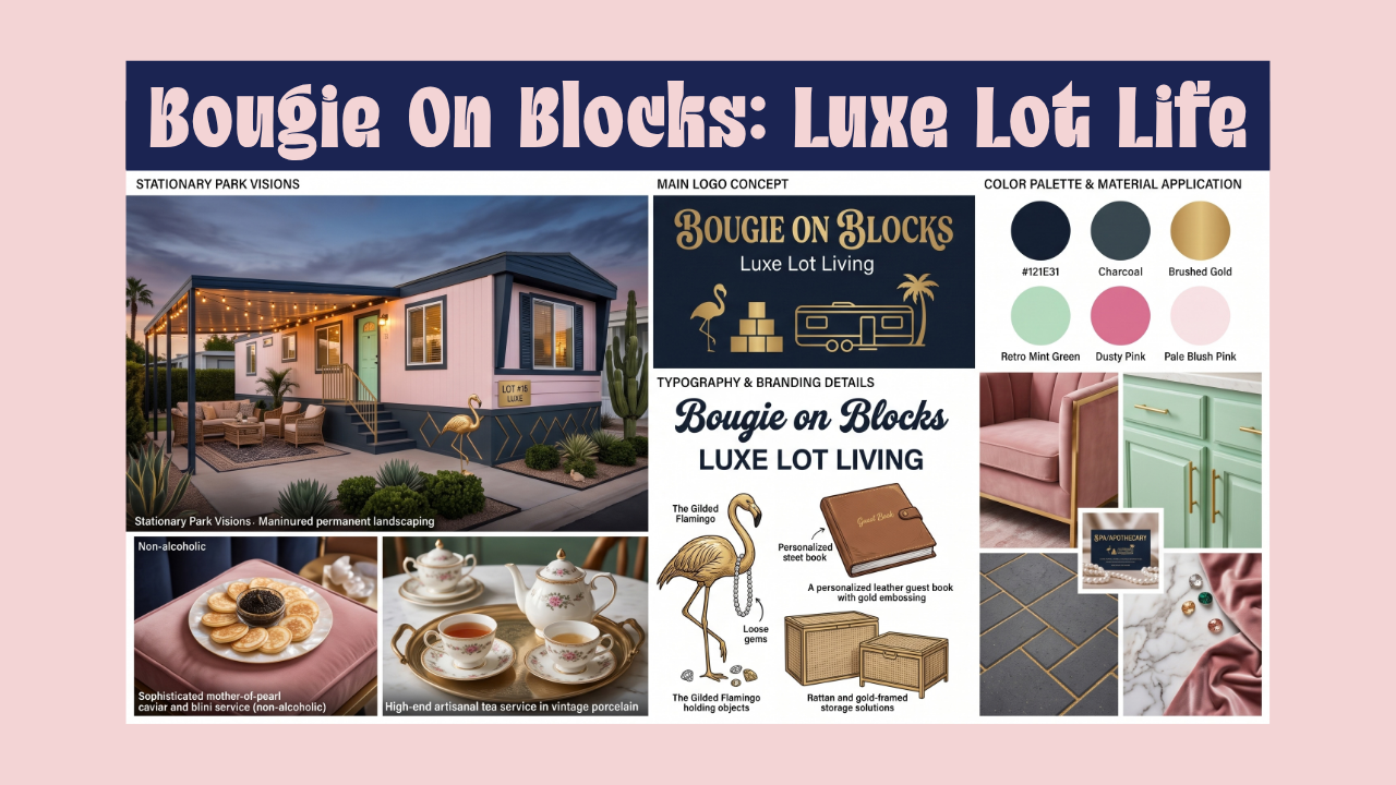
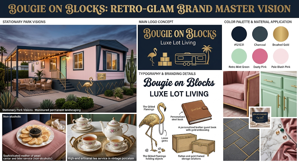
Here is a visual branding board that brings your “Retro Glam Luxe Lot Living” concept to life, incorporating the specific color palette and non-alcoholic luxury elements you requested:
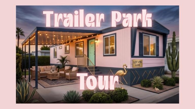
- Stationary Park Visions: I’ve visualized what a high-end, stationary manufactured home looks like. Notice the manicured permanent landscaping, the “on blocks” skirting detail, and a sophisticated pink and navy exterior with a mint green door.
- Color Palette & Materials: This section highlights how your specific color choices work together—Midnight Navy, Charcoal, Brushed Gold, Retro Mint Green, Dusty Pink, and Pale Blush Pink—alongside luxurious textures like velvet, marble, and rattan.
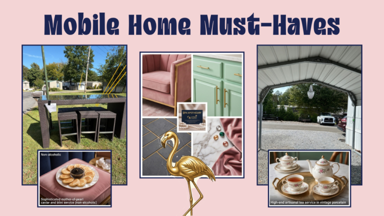
- Non-Alcoholic Luxury: Instead of champagne, I’ve included high-end artisanal tea service and a sophisticated mother-of-pearl caviar and blini service to signify “bougie” living without alcohol.
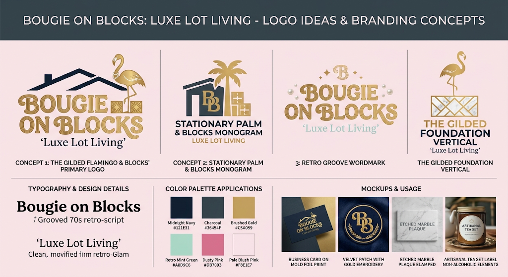
- Logo & Branding Details: This layout explores typography and logo ideas, including a golden flamingo paired with loose gems to replace the diamond-studded look you disliked.
This board should give you a clear, comprehensive idea of how all these diverse elements can blend into a single, cohesive brand identity. What do you think of this visual direction?
logo ideas?